Shedding a New Light on the Universe
Light Curves
A light curve is a graph of intensity over time. Such a graph is made by counting the number of photons coming from a source over a period of time. For example, by counting the number of X-rays being emitted by a star every second for an hour, you could generate a light curve from your observations. Your light curve would tell you how bright your source is and the amount of time it remained at that brightness. A graph similar to a light curve can be generated for any physical measurement which is repeated over and over in time. You could count how many people passed in front of you during a ten minute time interval while you sat on a park bench during your lunch hour. You could generate a "light curve" for this as well, but it would have no astronomical value (of course!).
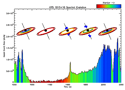
Here is an example of a light curve and what it can tell us about a source. This particular source is a black hole named GRS 1915+105. It has a disk of matter around it (called an accretion disk), as a result of having a companion star. As the two stars orbit each other, the black hole, having the stronger gravity, pulls matter off the other, causing it to spiral inwards towards the center of the black hole. This matter heats up to extremely hot temperatures and as a result, gives off X-rays. Below is a light curve created from the observations RXTE did of this binary system. You'll notice there is a something a bit odd about the way its accretion disk behaves.
 |
This is color coded for different energies of X-rays. The energy of the X-rays changes very dramatically at around 1200 seconds and again at 1600 seconds. At 1200 seconds, the intensity of X-rays falls. This is where the inner portion of the accretion disk disappears. At 1600 seconds, an intensity flare appears. It is this flare which seems to be the trigger point for jets of matter escaping from the black hole. This seems to occur regularly on a short timescale, leaving visible traces in the X-ray and infrared. If the source is examined on a longer timescale though, larger jets appear at the same point, just much less often than the smaller ones. After the flare, we can see the inner accretion disk fill itself in again. This can be seen in the small diagram above the light curve, each phase lined up with the relevant section of the light curve below.
This is a very unusual X-ray source, and it is thanks to light curves that we know as much as we do about it! If you would like more information on this particular source, try reading our January RXTE Discovery article!

Previous |

Next |


