fv Home fv Home
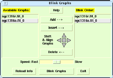
Next: Region Files Up: No Title Previous: Contour Maps BlinkingThe term `blinking' means to rapidly switch the display between 2 or more images. This is a very effective way to look for changes in brightness or position of objects in the images. To demonstrate this, we first need to open and display the images in the files ngc1316o.fit and ngc1316r.fit. If the POW canvas currently displays the contour plots from the previous section, then it may be simpler at this point to completely close fv and POW (from the Desktop Manager window) then reopen and display the 2 images side by side on the POW canvas. You may need to enlarge the POW canvas or resize or reposition the 2 images in order to see them both at once. Pow provides 2 methods for blinking images. The first method, called `Blink Graphs' under the tools menu, allows any set of graphs, regardless of their contents, to be blinked. Basically, this method works by stacking all the graphs on top of each other on the POW canvas, and then alternately raising each graph to the the top of the stack where it is then visible. To try this, click on `Blink Graphs' (not `Blink Images'!) under the tools menu to bring up the control panel (Figure 10). All the available graphs are listed in the left panel; select each graph in turn, then click on the `Add' button so that it appears in the right hand list of the graphs to be blinked (the order is not important in this case). Once both graphs are listed on the right, click on the `Blink Graphs' button to start the blinking. You will probably not see anything happen at this point if the graphs are not overlapping, so either drag one graph on top of the other, or use the center square in the compass-like figure in the control panel to align the upper right corners of the graphs. The blinking speed can be controlled with the slider bar, and the relative positions of the graphs can be adjusted using the 4 triangular compass point buttons (hold the shift key down for finer adjustments).
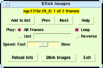
While the blink graphs method is very flexible, the main drawback is that it can be difficult to exactly align the graphs. You must manually adjust the sizes of the graphs to make them agree, and if you zoom in on one graph, then the other graph does not automatically get zoomed as well. So in cases like this, where the images have a common (or at least overlapping) coordinate system, it is better to use the `Blink Images' method which inserts multiple images into a single graph, and then alternately raises each image to the top of the stack. In this case the registration of the images is rigidly defined by the coordinate system associated with each image, so there is no problem aligning the images. (Note that it is not necessary for the images to have the same size or scale). If you zoom in on an area in the graph, then all the images are zoomed equally, so the they always remain registered. To use this `blink images' method we first have to combine both images, which are currently in separate graphs, into a single graph. The simplest way to do this is to make ngc1316r the current graph, (you may need to separate the graphs on the canvas if they are still on top of each other from the previous graph blinking), then use `Merge Graphs' under the Edit menu to merge the contents of the ngc1316o, into the current graph. Now bring up the `Blink Images' control panel (Figure 11) from under the Tools menu, select `All Frames' and `Loop', then click on 'Blink Images' to start the blinking. Now, unlike the previous case, the images remain exactly aligned regardless of how the graph is resized or zoomed.
Note that both methods can be used to blink any number of graphs or images, limited only by the amount of available memory on your machine. An interesting demonstration of this can be see by opening and displaying the image of the `datacube.fit' sample FITS file. This file contains 30 2-dimensional images, packed into a single 3-d datacube where each plane of the cube represents the strength of the 21-cm HI emission from the galaxy at a slightly different wavelength. When you display this image fv will ask which planes of the image (from 1 to 30) are to be displayed, and then will blink through the planes like a short movie. These data are rather noisy, so selecting the Gray color table under the Colors menu may give a clearer image.
fv Home
Next: Region Files Up: No Title Previous: Contour Maps Project Scientist: William Pence Project Engineer : Pan Chai July 2008 |