fv Home fv Home
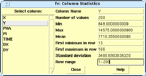
Next: Histograms Up: No Title Previous: Table Editing Table Analysis and Plotting toolsfv also contains a number of tools for doing basic types of data analysis. The Statistics menu (Figure 16) gives the minimum, maximum, and mean values for any selected column. The 'Row range' box can be used to restrict the calculations to a subset of the rows (for example, "2,4,6,10-20,30-40").
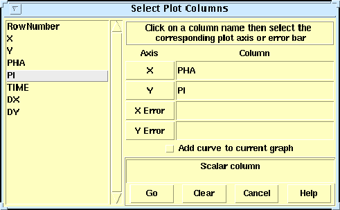
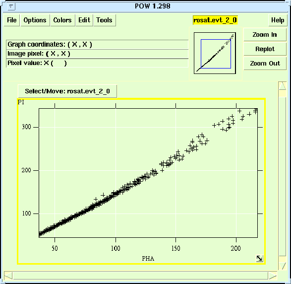
There are also extensive table plotting functions, which again make use of the POW graphics tool that we saw earlier in the discussion of FITS images. The Plot menu (Figure 17) lets you plot the values in any column as a function of row number, or plot the values in one column versus another column. For example, enter PHA for the X axis and PI for the Y axis, then click on `Go' to bring up the POW plot. (Figure 18). You can then zoom in on any region of the plot by either dragging out a rectangle of interest with the right mouse button, or by using the zoom buttons at the upper right of the POW window. You can also switch between linear or logarithmic axes with the Axes Transforms option under the Edit menu, and you can modify almost all other properties of the plot such as the labels, tick marks, point and line style and color, with the 'Edit Graphs' menu item. Finally you can produce a hardcopy of the plot in postscript format from the File menu.
fv Home
Next: Histograms Up: No Title Previous: Table Editing Project Scientist: William Pence Project Engineer : Pan Chai July 2008 |