
make a plot
|
| Syntax: | plot | <plot type>[<plot type>] [<plot type>] ... |
|---|
<plot type> is a keyword describing the various plots allowed. Up to six plot panes can be put on a single page by combining multiple <plot type> options. For example:
plot data resid ratio modelwill produce a 4-pane plot. However contour plots may not be combined with other plots in this manner. When a certain plot type takes additional arguments (eg. chain, model), simply list them in order prior to specifying the next plot type:
plot chain 3 4 data ufspecPlots which show results from separate plot groups can take a plot group specification before the plot option. For instance if we have three plot groups but we only what to show data and residuals for the first two then
plot 1-2 data residNote that there is a potential conflict if a plot option that takes additional arguments (e.g. chain) is followed by an option that can be preceded by plot group arguments (e.g. data). In these cases the arguments are assumed to apply to the first plot option.
In multi-pane plots, XSPEC will determine if two consecutive plot types may share a common X-axis (e.g. plot data delchi, or plot counts ratio). If so, the first pane will be stacked directly on top of the second. (Note that the small subset of multi-pane plots that were allowed in earlier versions of XSPEC all belonged in this category.)
For changing plot units, see setplot energy and setplot wave. Also see iplot for performing interactive plots.
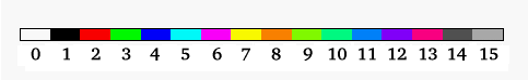
When plotting colors the ordering is from pgplot and is shown in Figure 5.1.
- background
-
Plot only the background spectra (with folded model, if defined). To plot both the data and background spectra, use plot data with the setplot background option. - chain
-
Plot a Monte Carlo Markov chain.plot chain [thin <n>] [mean] [auto <n>] <par1>[<par2>]
Chains must be currently loaded (see chain command), and <par1> and <par2> are parameter identifiers of the form [<model name>:]<n> or for response parameters [<source number>:]r<n> where <n> is an integer, specifying the parameter columns in the chain file to serve as the X and Y axes respectively. To select the fit-statistic column, enter '0' for the <par> value. If <par2> is omitted, <par1> is simply plotted against row number.
Use the thin <n> option to display only 1 out of every <n> chain points. Example:
# plot one in five chain points,
# using parameters 1 and 4 for (X,Y)
plot chain thin 5 1 4
The thin value will be retained for future chain plots until it is reset. Enter thin 1 to remove thinning.Use the mean option to display the running mean based on all previous chain values instead of the chain value.
Use the auto <n> option to display the autocorrelation function for the chain where <n> is the number of lags to plot. auto cannot be used at the same time as mean and it will ignore the setting of thin. auto only uses one parameter identifier. For example:
plot chain auto 50 2
- chisq
-
This is now equivalent to plot fitstat. The statistic contribution is plotted +ve or -ve depending on whether the residual is +ve or -ve. - contour
-
Plot the results of the last steppar run. If this was over one parameter then a plot of statistic versus parameter value is produced while a steppar over two parameters results in a fit-statistic contour plot.plot contour [<min fit stat>[<# levels>[<levels>]]]
where <min fit stat> is the minimum fit statistic relative to which the delta fit statistic is calculated, <# levels> is the number of contour levels to use and <levels> := <level1> ... <levelN> are the contour levels in the delta fit statistic. contour will plot the fit statistic grid calculated by the last steppar command (which should have gridded on two parameters). A small plus sign '+' will be drawn on the plot at the parameter values corresponding to the minimum found by the most recent fit.
The fit statistic confidence contours are often drawn based on a relatively small grid (i.e., 5x5). To understand fully what these plots are telling you, it is useful to know a couple of points concerning how the software chooses the location of the contour lines. The contour plot is drawn based only on the information contained in the sample grid. For example, if the minimum fit statistic occurs when parameter 1 equals 2.25 and you use steppar 1 1.0 5.0 4, then the grid values closest to the minimum are 2.0 and 3.0. This could mean that there are no grid points where delta-fit statistic is less than your lowest level (which defaults to 1.0). As a result, the lowest contour will not be drawn. This effect can be minimized by always selecting a steppar range that causes XSPEC to step very close to the true minima.
For the above example, using steppar 1 1.25 5.25 4, would have been a better selection. The location of a contour line between grid points is designated using a linear interpolation. Since the fit statistic surface is often quadratic, a linear interpolation will result in the lines being drawn inside the true location of the contour. The combination of this and the previous effect sometimes will result in the minimum found by the fit command lying outside the region enclosed by the lowest contour level.
A grey-scale image of the data being contoured is also plotted. This can be removed by using the PLT command image off.
An example use of plot contour is:
# create a  grid for parameters 2 and 3
steppar 2 0.5 1. 4 3 1. 2. 4
# Plot out a grid with three contours with
# delta fit statistic of 2.3, 4.61 and 9.21
plot contour
# same as above, but with a delta fit statistic = 1 contour.
plot cont,,4,1.,2.3,4.61,9.21
- counts
-
Plot the data (with the folded model, if defined) with the y-axis being numbers of counts in each bin. - data
-
Plot the data (with the folded model, if defined). - delchi
-
Plot the residuals in terms of sigmas with error bars of size one. In the case of the cstat and related statistics this plots (data-model)/error where error is calculated as the square root of the model predicted number of counts. Note that in this case this is not the same as contributions to the statistic. - dem
-
Plot a histogram of the relative contributions of plasma at different temperatures for multi-temperature models. This is not very clever at the moment and only plots the last model calculated. - eemodel
-
See model. - eeufspec
-
See ufspec. - efficien
-
Plot the total response efficiency versus incident photon energy. - emodel
-
See model. - eqw
-
Plot the probability density of the most recently run eqwidth calculation with error estimate. - eufspec
-
See ufspec. - fitstat
-
Plot the contribution to the fit statistic from each bin. The contribution is plotted +ve or -ve depending on whether the residual is +ve or -ve. - goodness
-
Plot a histogram of the statistics calculated for each simulation of the most recent goodness command run. Optional arguments are the number of histogram bins and either log or lin to indicate log or linear bins. - icounts
-
Integrated counts and folded model. The integrated counts are normalized to unity. - insensitivity
-
Plot the insensitivity of the current spectrum to changes in the incident spectra. Insensitivity is (the energy of the bin) divided by the square root of (the response for the bin squared divided by the data variance of the bin). - integprob
-
Plot the integrated probability distribution from the results of the most recently run margin command (must be a 1-D or 2-D distribution). The integrated probability is calculated by summing bins in decreasing order of probability. This option takes the same arguments as the contour except that the first argument (<min fit stat>) is ignored. So, to change the integrated probability levels plotted eg.plot integprob,,4,0.68,0.90,0.95,0.997
A grey-scale image of the data being contoured is also plotted. This can be removed by using the PLT command image off. - lcounts
-
Plot the data (with the folded model, if defined) with a logarithmic y-axis indicating the count spectrum - ldata
-
Plot the data (with the folded model, if defined) with a logarithmic y-axis. - margin
-
Plot the probability distribution from the results of the most recently run margin command (must be a 1-D or 2-D distribution). A grey-scale image of the data being contoured is also plotted. This can be removed by using the PLT command image off. - model, emodel, eemodel
-
Plot the current incident model spectrum (Note: This is NOT the same as an unfolded spectrum.) The contributions of the various additive components are also plotted. If using a named model, the model name should be given as an additional argument. emodel plots or, if plotting wavelength,
 . eemodel plots
  , or if plotting
wavelength,
, or if plotting
wavelength,
 . The
. The  (or
(or  ) used in the
multiplicative factor is taken to be the geometric mean of the lower and
upper energies of the plot bin.
) used in the
multiplicative factor is taken to be the geometric mean of the lower and
upper energies of the plot bin.
- polangle
-
Plot the polarization angle for the data and the model. This requires triplets of I,Q,U Stokes parameter spectra in each data group. The angles all lie between the mean angle 90 degrees.
- polfrac
-
Plot the polarization fraction for the data and the model. This requires triplets of I,Q,U Stokes parameter spectra in each data group. - ratio
-
Plot the data divided by the folded model. - residuals
-
Plot the data minus the folded model. - sensitivity
-
Plot the sensitivity of the current spectrum to changes in the incident spectra. Sensitivity is (the model squared) multiplied by the sum of (the response for the bin squared divided by the data variance of the bin). - sum
- A pretty plot of the data and residuals against both channels and energy.
- ufspec, eufspec, eeufspec
-
Plot the unfolded spectrum and the model. The contributions to the model of the various additive components also are plotted. WARNING ! This plot is not model-independent and your unfolded model points will move if the model is changed. The data points plotted are calculated by D*(unfolded model)/(folded model), where D is the observed data, (unfolded model) is the theoretical model integrated over the plot bin, and (folded model) is the model times the response as seen in the standard plot data. eufspec plots the unfolded spectrum and model in, or if plotting wavelength,
. eeufspec
plots the unfolded spectrum and model in , or if plotting wavelength,
. The E (or ) used in the multiplicative factor
is taken to be the geometric mean of the lower and upper energies of the plot
bin.
HEASARC Home | Observatories | Archive | Calibration | Software | Tools | Students/Teachers/Public
Last modified: Tuesday, 28-May-2024 10:09:22 EDT